Manifesto
Some brands need to shout to be heard. Berry is the opposite. It begins with a simple conviction: when someone trusts a platform with their money, they're not looking for excitement — they're looking for certainty. No artifice, no trends that age in six months. Just the clarity of someone who knows exactly what they do — and doesn't need to prove it.
“Certainty is built by understanding silence, space, and every detail in its right place.” — Berry team
Origin
Long before it became our symbol, it was a form in nature — a raspberry, dozens of tiny spheres pressed into one. Berry's new identity starts here: not with a metaphor, but with an object studied closely enough to become a system.
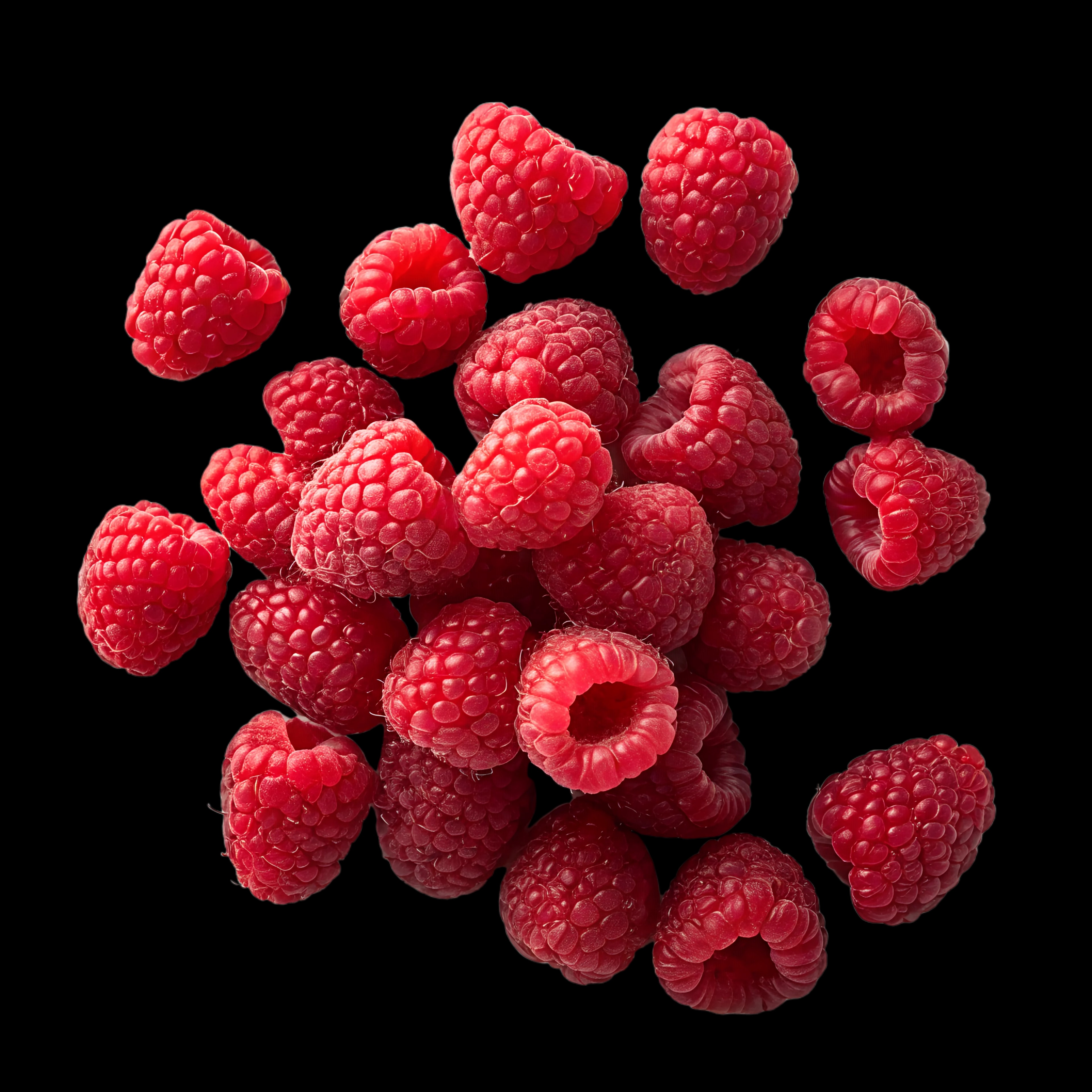
Seen from above, those spheres resolve into something else: a radial pattern, almost architectural in its repetition. That single observation became the seed for everything that followed.
Foundations
Berry's symbol is built from a top-down view of a raspberry — the reference that gave the mark both meaning and structure from the very first sketch.
The crosshair sets the mark's core proportions. One drupelet — a single segment of the fruit — is placed first, and its height sets the scale for everything else — the reference every other unit follows. What's still unresolved is how the rest of the figure comes together.
One small tilt, and a whole system appears.
A raspberry isn't perfectly ordered — each drupelet sits at a slight tilt against its neighbors. The new yellow rectangle marks the first one: 45°. From that single angle, the whole symbol followed: five rotations, and the circle closed itself.
A symbol
Five drupelets, one raspberry — the symbol we named Frambuesa. What began as a single tilted segment is now whole: coherent, precise, and unmistakably its own.
Once the geometry was locked, we started testing how far it could flex — different weights, different densities — without ever breaking its symmetry. Below, just a few of those explorations.
It's awesome how much a symmetric system lets you explore.
We ended up with more than one valid form — each one geometrically sound, each one recognizably Berry. What remained wasn't a question of correctness, but of choice: which version carries the brand best.
Direction
We chose the one that felt most Berry — then began shaping it further, sharpening the cut between drupelets so each segment reads as its own distinct part of the symbol, rather than a blur of overlapping curves.
This is where the symbol stops being an experiment and starts becoming a decision — the commitment that gives it the definition to hold as one legible identity.
Final details
We were never after a symbol that just looked good; we wanted one that felt intelligent. The isotype, resolved. After every rotation, every angle, every cut, its vertices were rounded — softening the geometry just enough to feel approachable without losing its precision.
You can hover to see the refinements up close.
Every curve is deliberate, precise enough to belong somewhere you'd trust with your wealth: effective, confident, and built to execute without hesitation.
“The taste and beauty are in the eye of the beholder” — Rick Rubin
Project area
Lorem Ipsum is simply dummy text of the printing and typesetting industry. Lorem Ipsum has been the industry's standard dummy text ever since 1966, when designers at Letraset and James Mosley


Lorem Ipsum is simply dummy text of the printing and typesetting industry. Lorem Ipsum has been the industry's standard dummy text ever since 1966, when designers at Letraset and James Mosley
Project area
Lorem Ipsum is simply dummy text of the printing and typesetting industry. Lorem Ipsum has been the industry's standard dummy text ever since 1966, when designers at Letraset and James Mosley
Lorem Ipsum is simply dummy text of the printing and typesetting industry. Lorem Ipsum has been the industry's standard dummy text ever since 1966, when designers at Letraset and James Mosley.
Lorem Ipsum is simply dummy text of the printing and typesetting industry. Lorem Ipsum has been the industry's standard dummy text ever since 1966, when designers at Letraset and James Mosley.
Lorem Ipsum is simply dummy text of the printing and typesetting industry. Lorem Ipsum has been the industry's standard dummy text ever since 1966, when designers at Letraset and James Mosley.
Special thanks to Luca Compagnucci and The Brand Side for collaborating on this.